The Hachioji Library is a building designed by the architect Toyo Ito and his associates, completed in 2007. It’s correlated with the Tama Arts University located in Tokyo, Japan. With the Kaminogué Library, it constitutes the Tama Arts Library. Its collection mainly includes materials on design, architecture, film, photography and other related topics.
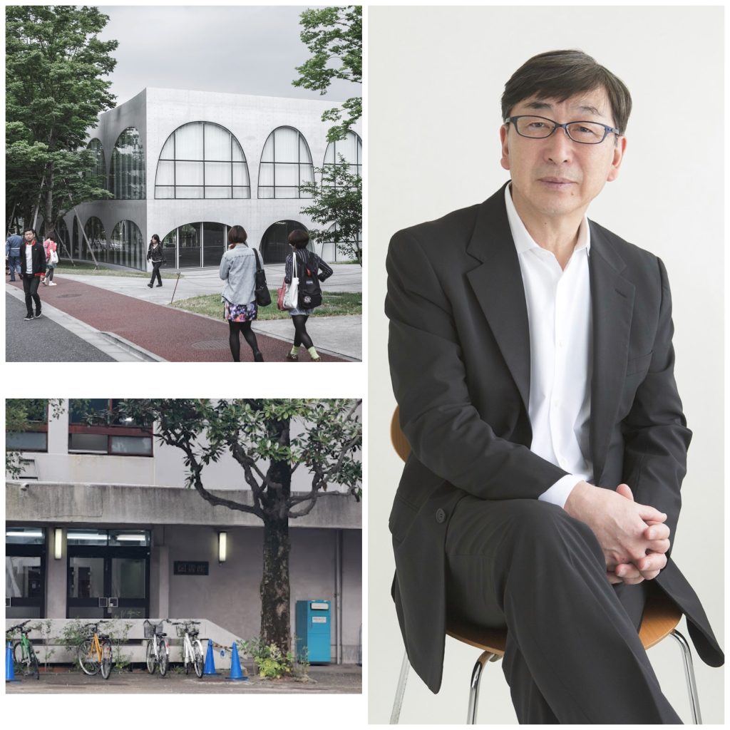
The building was constructed using both steel and concrete, it’s two stories high, and has a basement. It has been featured in a variety of professional architecture publications, including DETAIL, Architectural Review, and several others.
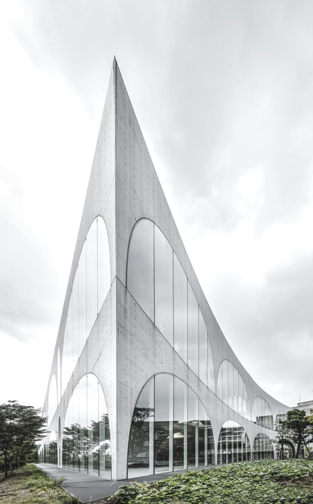
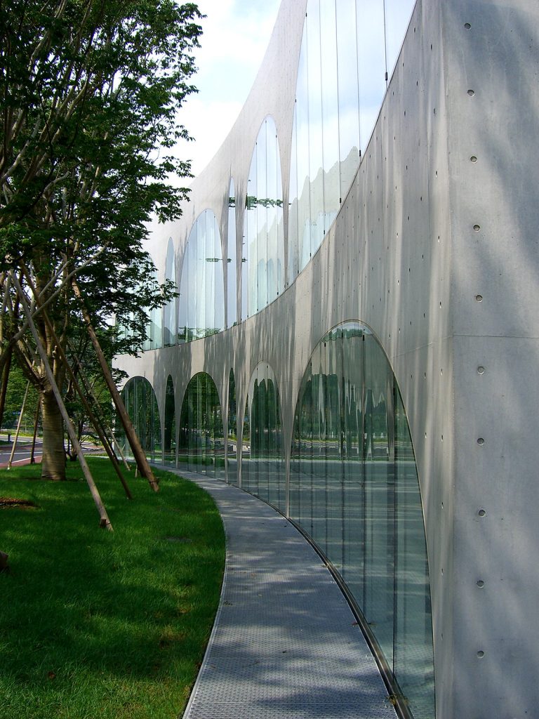
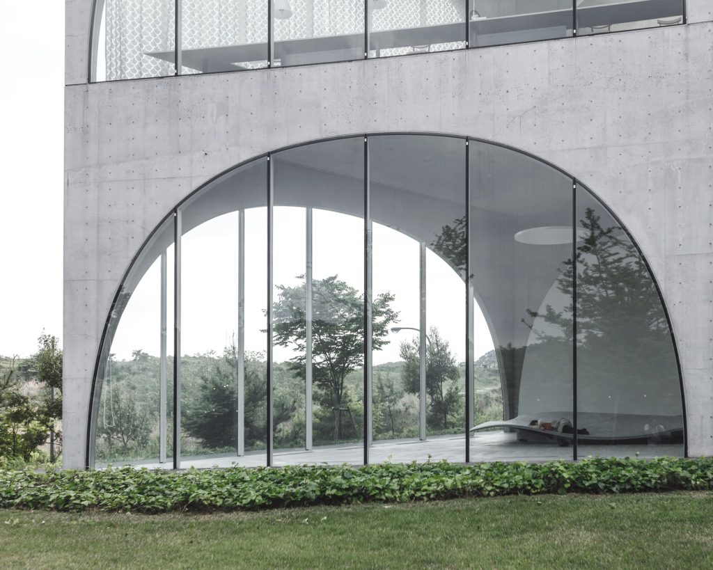
The facade is curved in two sides, keeping a right angle at the corner with less traffic. The glass panels are mounted on aluminum frames previously cut and folded 4mm to maintain the curvature of the facade.
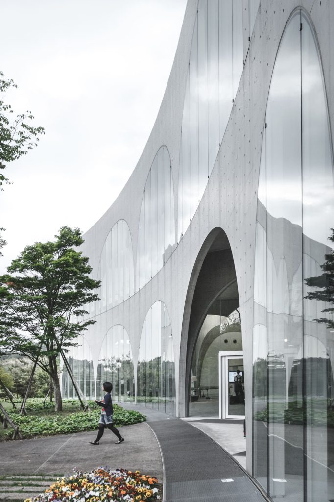
Although the facade of the building is impressive, the greatest achievement of the construction is the interior spatial treatment, where the arches in apparent chaos, simulate stalactites and create multiple and varied effects of perspective.
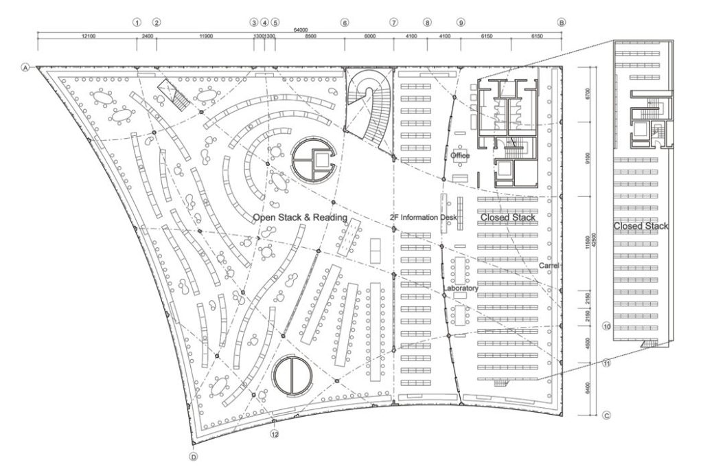
This effect is created thanks to a gentle, three-degree slope on its ground floor, with colonnades which provide a simple, archlike structural support. These arches are formed with plate steel reinforced with concrete, with walls measuring 200 mm thick. The spans of the arches vary from 1.8 to 16 meters.
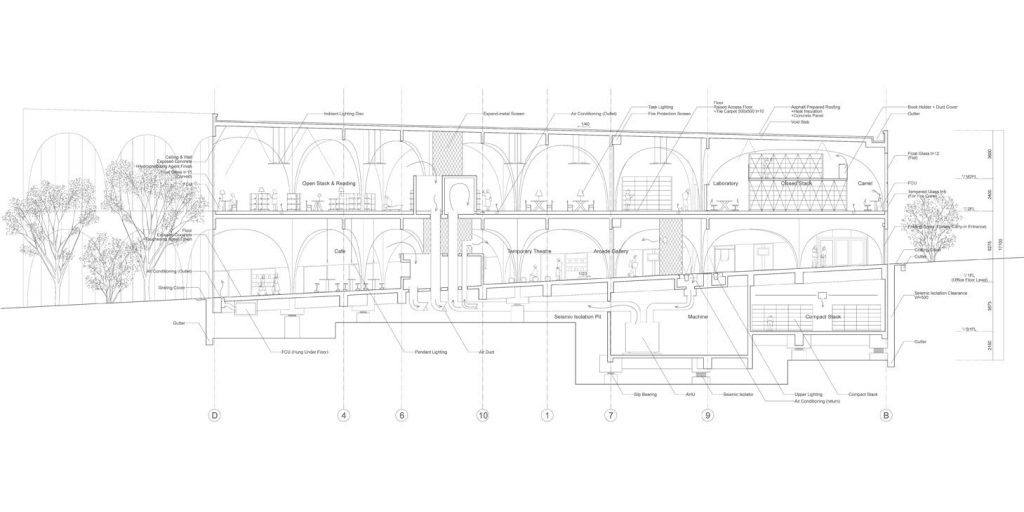
Rows of these colonnades are arranged in a configuration that produces a variety of interior spatial types and exterior views. The spatial diversity one experiences when walking through the arches different in span and height changes seamlessly from a cloister-like space filled with natural light, to the impression of a tunnel that cannot be penetrated visually.
On the western side of the building, elm trees are planted and the library seats seem embraced by the warmth of the timber. The trees also function to soothe the sunlight extending from the west. The curtains likewise help soften the sunlight, creating calming shades akin to sunbeams reaching through leaves.
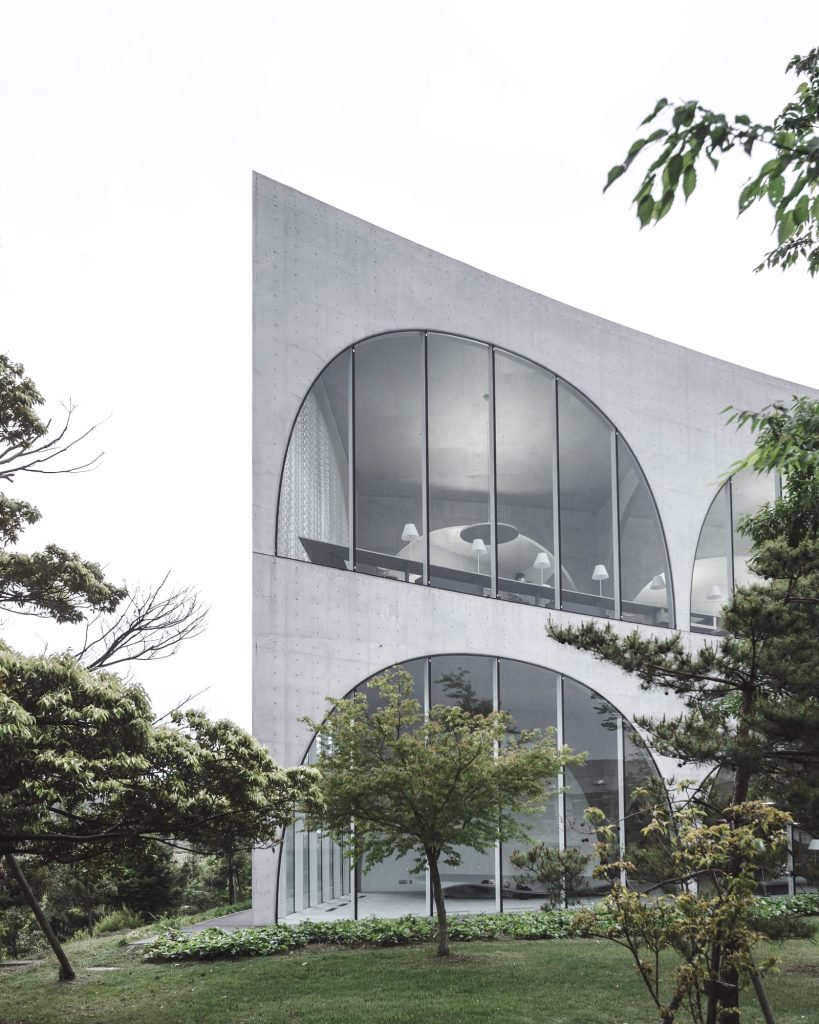
Hachioji Library was designed to complement its physical location. The building’s arches, along with the surrounding glass walls, flow with the land that the library sits on.
The furniture was specially designed in a similar way, by Fujie Kazuko, to accommodate the landscape’s sloping surfaces.
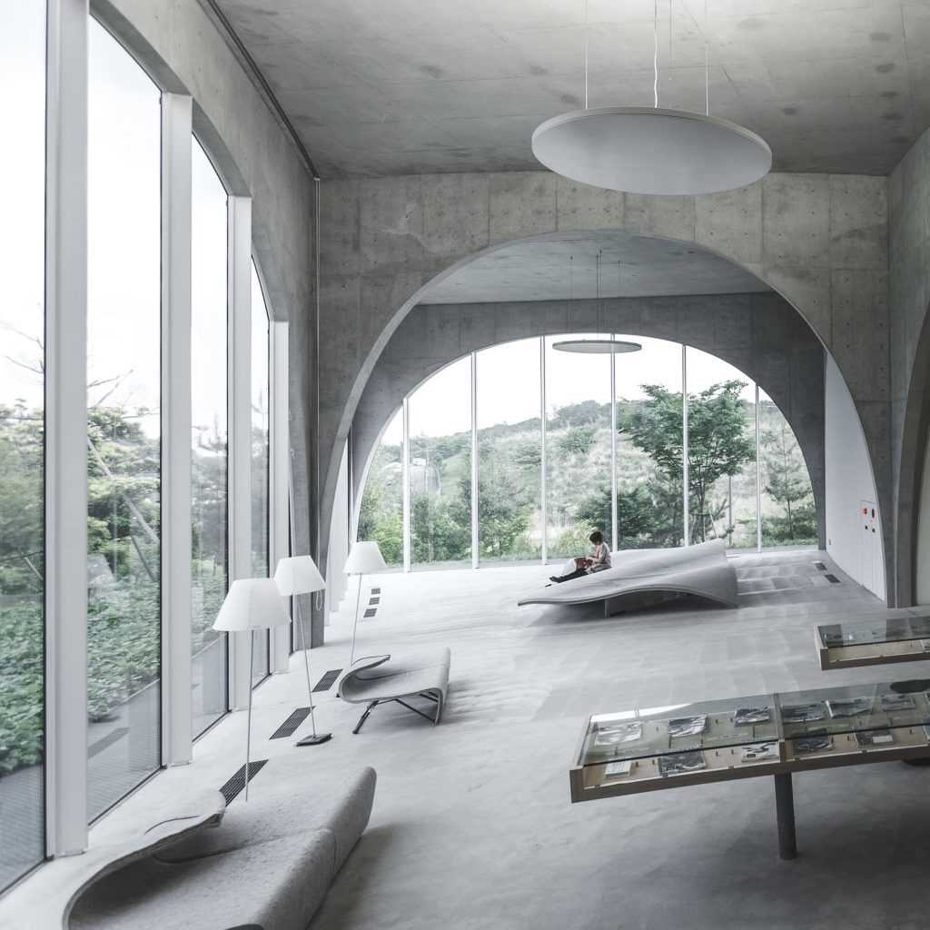
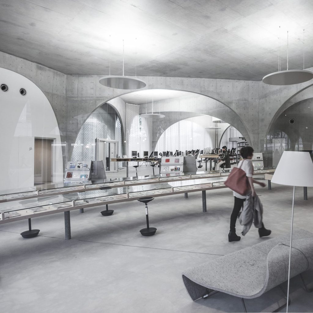
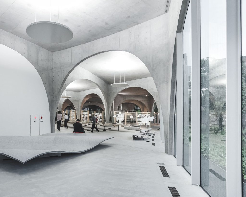
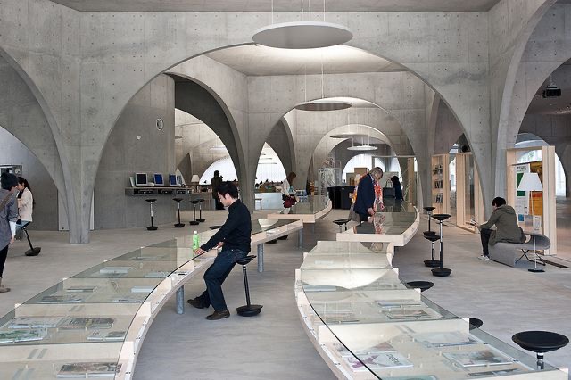
The intersections of the rows of arches or joints, gently help separate areas within this single space. This intersection forms a cross that besides emphasizing the directionality of geometry, has a seismic effect on the structure.
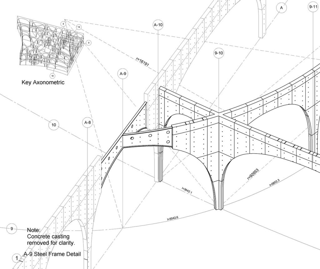
The new Library of the University of Tama Arts is a place where everyone can find their style of “interact” with either books or multimedia technology, as if they were walking through a forest or in a cave.
I love Toyo Ito´s idea of flowy space, of undefined limmits, especially when a building has a purpose similar to a library, where thoughts run wild, and learning has no restrictions or end. I think that the fact that it´s chaotic makes it such a good place to organice and clear your mind and thoughts, but that might just be my maximalistic point of view.
Bibliography
https://www.tamabi.ac.jp/english/about/library.htm
https://en.wikiarquitectura.com/building/tama-art-university-library/